According to fnac.com, the artwork for the remastered edition of Brotherhood would be this:

What the f***k is that? 
62 replies · 8,342 views
According to fnac.com, the artwork for the remastered edition of Brotherhood would be this:
What the f***k is that?
Seems as if they thought the original cover wouldn't stand out in the racks and tarted it up?
Wow?! The update looks like something Saville would do, I don't think this was done by the record company alone.
I wonder if they'll be updating all the artwork?
I like it too.. I guess it's to differentiate it with the old Brotherhood cover? I wonder how the other remaster covers are gonna look.
I saw the original sheet of metal that was photographed for the Brotherhood cover when at the Peter Saville show in the Design Musuem a few years ago - was a lot shinier, like this picture.
May not be a Photoshop job at all - just the same piece of metal battered with a mallet! Maybe it represents Saville's opinion of the remastered editions!
Andy
Well, browsing through the other FNAC images, the only one which looks vaguely different is PC&L:
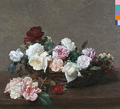
The image above looks a bit clearer than the original?

Ben wrote: According to fnac.com, the artwork for the remastered edition of Brotherhood would be this:
What the f***k is that?
I think that artwork looks a lot like this:

That's a close-up from the Frankie Goes To Hollywood-sleeve Maximum Joy from the year 2000! 
Luke wrote:
Ben wrote: According to fnac.com, the artwork for the remastered edition of Brotherhood would be this:
What the f***k is that?
I think that artwork looks a lot like this:

It's from Frankie!
It looks like the "State of the Nation" sleeve in negative with the "Brotherhood" typo on top of it.
Looks fucking great, I think. I'm sure whoever said that it's necessary to make it stand out on the shelf is right. Some 12" covers look shit when scaled down to cd size - the original work is one of them. It's reminiscent of UP, which is a nice link. I wonder whether Bill was involved.
BILL!
Ben wrote: According to fnac.com, the artwork for the remastered edition of Brotherhood would be this:
What the f***k is that?
What the fuck is with the type? The original had the type on a flat sheet, here the sheet is all wrinkled, so should be the type, or no type at all. Honestly I don't believe this is going to be the cover, seems like someone's played with NO art. Following this logic, the Movement cover should be also re-mixed.
I quite like it actually,but as a new sleeve,the remaster should stay faithfull to the originals IMO 
Nick King wrote: Well, browsing through the other FNAC images, the only one which looks vaguely different is PC&L:
The image above looks a bit clearer than the original?
Seems like that to my eyes too. Remastered tracks.. remastered covers!
looks like one of the worst covers they've ever had...
and that's saying a lot...
especially the horrible 'single's, 'waiting for the sirens call album, single', 'get ready', etc etc..
i know this has to be a joke, and not a very good one either..
if you ever wanted a reason NOT TO BUY the remaster, here you go...
later -1
the thinking.... new covers ---> collectors must have to buy now 
Hopefully Saville would be consulted about any changes to his originals who knows. I dunno.
Even Technique has had some subtle changes done to it according to fnac.com
 -"new"

-wikipedia
Retroesque wrote: Even Technique has had some subtle changes done to it according to fnac.com
-wikipedia
They look exactly the same to me, the first one though has the sharpened contrast effect that usually gives you the illusion of a better quality.
musicoloog wrote:
Luke wrote:
Ben wrote: According to fnac.com, the artwork for the remastered edition of Brotherhood would be this:
What the f***k is that?
I think that artwork looks a lot like this:

It's from Frankie!
It looks like the "State of the Nation" sleeve in negative with the "Brotherhood" typo on top of it.
It's not. As I said above:
I saw the original sheet of metal that was photographed for the Brotherhood cover when at the Peter Saville show in the Design Musuem a few years ago - was a lot shinier, like this picture.
It's probably just the same piece of metal battered with a mallet!
Ew. I'm hoping that's not the final artwork for Brotherhood. I liked the minimalist look of the original a lot better. I'll just cross my fingers and hope that this image was just a picture taken of the CD wrapped in plastic with a glare reflecting off it causing it to look this way. The artwork itself doesn't appear to be warped underneath, just the layer on top.
Igor wrote: The cover of Lowlife in fnac.com
is slightly different from what I'm used to
 It's the FNAC version the one I'm used to, with the "Ordernew" logo on the right side!
Right?:D
It's the FNAC version the one I'm used to, with the "Ordernew" logo on the right side!
Right?:D
I know im in the minority but I dont care much for the original artwork to Brotherhood. Its a bit dull and boring and reflects alot of the music. Hopefully the shiny new cover will reflect a shinier remaster. I think Brotherhood could have been brilliant if someone like Eno had produced it.
I like the Brotherhood sleeve, looks like a sheet of lead. As long as the US releases don't have New Order stamped on all the covers....
Monsieur Round & Round wrote:
It's the FNAC version the one I'm used to, with the "Ordernew" logo on the right side! Right?:D
You could move it to the left or the right, no?
Brian Barker wrote: I like the Brotherhood sleeve, looks like a sheet of lead. As long as the US releases don't have New Order stamped on all the covers....
There'll be stickers all over them, nothing's surer than that.

"Metal Sheet for Brotherhood 915 x 445 mm Trevor Key and Peter Saville, 1986
Metal sheet used for the cover of New Order's Brotherhood album (Factory Records, 1986), pictured here in Trevor Key's studio. Reminiscent of Yves Klein's experiments with essential elements such as fire and air, the sheet was subjected to various degrees of heat treatment to buckle and warp the surface."
from 'Peter Saville Estate' book.
:)
apparently everyone can relax now (well ok, people that don't like it),
or can we!!!!!!!!!!!!!!!!!!!!!!!!
are we ever going to know?
are the us and uk versions are the same? different? looks like the UK one is different now...
later -1
Cleverarse wrote:
Monsieur Round & Round wrote:
It's the FNAC version the one I'm used to, with the "Ordernew" logo on the right side! Right?:D
You could move it to the left or the right, no?
not on the original, no.
I always liked the artwork on the Brotherhood album. It seemed very modern, cold and stylish. I know a lot of people don't like it but whether it's good or bad, at least it was an attempt. Something a little different.
That alterate one looks like a provided sample of what you can do with photoshop. Lame.
hibster wrote:
Cleverarse wrote:
Monsieur Round & Round wrote:
It's the FNAC version the one I'm used to, with the "Ordernew" logo on the right side! Right?:D
You could move it to the left or the right, no?
not on the original, no.
exactly my point.
come on, it is f*ckin awesome.... and not some photoshop effect, but a synthesis with the original informative imagery....
it really is how it was most likely originally envisioned, they just didn't have the tech (no photoshop, etc) in 1986 to do it.
and that is what these remasters are, a revisioning of the original. releasing the songs as the artists dreamed at the moment.
so, sure, you are going to edit the cover art if necessary as well as the music.
Monsieur Round & Round wrote: I just don't know what to think of this
Yes, Mr NEGATIVE one, wot would you say now?
I actually quite like the 'remastered' cover (or the so-called photoshoped version) as I see it as being closer to the original vinyl cover in terms of 'composition', eg. the BILITON TITAANZINK lettering appears relatively tiny compared to the overall size of the zink sheet whereas all previous issues of BROTHERHOOD on CD has covers looking like a lazy cut-up version of the vinyl cover, spotting large cropped lettering on one side. I have those rare metallic cover versions in my collection - both metallic covers on vinyl & CD as well and yes, they do look great but I definitely look forward to seeing the remastered cover (with shiny metallic background...wishful thinking??) on vinyl.
Tarbox23 wrote: come on, it is f*ckin awesome.... and not some photoshop effect, but a synthesis with the original informative imagery....
it really is how it was most likely originally envisioned, they just didn't have the tech (no photoshop, etc) in 1986 to do it.
and that is what these remasters are, a revisioning of the original. releasing the songs as the artists dreamed at the moment.
so, sure, you are going to edit the cover art if necessary as well as the music.
Ironically, it looks dated, like something somebody though was cool back in 1999. It's just screams amateur hack lazy and cheap as opposed to a unique modern art design.
Here's an example
http://www.thedesignworld.com/photoshop-tutorials/filter-effects/liquid-metal/
Working with an already existing template like the Brotherhood sleeve would make it even easier.
To me, the new 'artwork' of Brotherhood is as lame as putting a 1994 True Faith remix dub-version on a 1986 Brotherhood-remaster bonusdisc which has nothing to do with the Factory years.
First, we got no real 80's stuff music-wise (while they call it their "Factory years" on the sticker!).
Second, we got no real original 80's artwork as it originally appeared on their album.
I wonder what's inside.
[just listen to the PSB-track Metamorphosis (it's on their 1996-album Bilingual) while you have the New Order remaster project in mind and you can REALLY start laughing...] :p
I don't know what everybody is complaining about - it's taken from a different part of the original artwork - see post above! 
Nick King wrote: I don't know what everybody is complaining about - it's taken from a different part of the original artwork - see post above!
unless its a different part of metal not shown, i don't see which part it matches with..
later -1
I'm struggling to understand the complaint about the artwork. Even if you don't like it, something positive is being done in this area. If they tried to replicate the old sleeves they would probably not come up to scratch.
Personally I like the new brotherhood cover, metallic sleeves would probably be cost prohibitive as would the tracing paper for Lowlife, which is also good (that said I always preferred the US sleeve to the UK, a thin strip of tracing paper with gold and black lettering).
gnp wrote:
"Metal Sheet for Brotherhood 915 x 445 mm Trevor Key and Peter Saville, 1986
Metal sheet used for the cover of New Order's Brotherhood album (Factory Records, 1986), pictured here in Trevor Key's studio. Reminiscent of Yves Klein's experiments with essential elements such as fire and air, the sheet was subjected to various degrees of heat treatment to buckle and warp the surface."
from 'Peter Saville Estate' book.
:)
did you folks not see this post above?
the new cd cover is NOT just some crap photoshop effect, (i've been using photoshop since version 2.5)
OMG THEY CHANGED THE COVER!!!!!!!!!!!!!!!!!!
p.s. -1, the old cd cover was crap, just an exploded crop from the original LP cover..... so the old cd cover was an 'aberration' from the HOLY original as well....
HOW DARE THEY!
Igor wrote: The cover of Lowlife in fnac.com
is slightly different from what I'm used to
That's my favorite CD cover artwork for "Low Life":


The reissue front artwork seems like the brazilian vinyl edition from 1987.
Tarbox23 wrote:
did you folks not see this post above?
the new cd cover is NOT just some crap photoshop effect, (i've been using photoshop since version 2.5)
OMG THEY CHANGED THE COVER!!!!!!!!!!!!!!!!!!
p.s. -1, the old cd cover was crap, just an exploded crop from the original LP cover..... so the old cd cover was an 'aberration' from the HOLY original as well....
HOW DARE THEY!
the new one is not from the original either, since its not the same... (none of it matches the picture posted)..
maybe that's why its so crappy..
the original album artwork is derived from the sculpture/artwork... if they wanted it to be the same originally, they would have done so, but they didn't, that's we all got used to derivation..
who owns the original? maybe they'll be happy with the new artwork..
later -1
Ironically, it looks dated, like something somebody though was cool back in 1999. It's just screams amateur hack lazy and cheap as opposed to a unique modern art design.
The example you have in your link is the kind of junk you're talking about up above. Like a happy hardcore compilation from 1997.
I like the retouch myself.
So has anyone seen the cover art for the re-re-release of Brotherhood? I saw a photo on a Web site that showed the old cover but with the text stating the album title and artist just like the old American CD cover (hated it-there should not have been any text). In one of the local independent record shops here it looks like they were still carrying the old stock.
anti-republic wrote: So has anyone seen the cover art for the re-re-release of Brotherhood? I saw a photo on a Web site that showed the old cover but with the text stating the album title and artist just like the old American CD cover (hated it-there should not have been any text). In one of the local independent record shops here it looks like they were still carrying the old stock.
lets hope those ppl were only being lazy when they were uploading pics for album covers  yea, i really hate those US issued CDs esp. PCL (with the title slapped bang above LaTour's flowers on the cover!
actually, we Aussies suffered a bit too with all NO/JD DVD releases cuz media authorities required all front cover to display 'classification' infos....so most front cover art has pretty large rectangular box with G or M etc... absolute sacrilege thing to do defacing peter saville's design!!!
yea, i really hate those US issued CDs esp. PCL (with the title slapped bang above LaTour's flowers on the cover!
actually, we Aussies suffered a bit too with all NO/JD DVD releases cuz media authorities required all front cover to display 'classification' infos....so most front cover art has pretty large rectangular box with G or M etc... absolute sacrilege thing to do defacing peter saville's design!!!
I checked the Website that had the Brotherhood cover art with the title written on it (idealcopy.com) and I noticed that the PCL cover art had the old American text as you described as well. Let's HOPE that the Webmaster at Ideal Copy simply didn't realise what he was doing.
One would think that Rhino would have had even a casual NO fan who would be able to discern that Every Little Counts would be the last song on disc one. State of the Nation can fit on disc two.
So am I to assume that the "new & improved" Brotherhood album cover is "here to stay"? Who made such a lousy decision, anyway?
poisoned Snickers r yummy... wrote: I actually quite like the 'remastered' cover (or the so-called photoshoped version) as I see it as being closer to the original vinyl cover in terms of 'composition', eg. the BILITON TITAANZINK lettering appears relatively tiny compared to the overall size of the zink sheet whereas all previous issues of BROTHERHOOD on CD has covers looking like a lazy cut-up version of the vinyl cover, spotting large cropped lettering on one side. I have those rare metallic cover versions in my collection - both metallic covers on vinyl & CD as well and yes, they do look great but I definitely look forward to seeing the remastered cover (with shiny metallic background...wishful thinking??) on vinyl.
Ditto. The less said about the audio contents (track listing) the better.... but I must say I think the "updated" Brotherhood artwork is quite an improvement. It's just a different photograph of the metal sheet, isn't it? I assume PC&L uses a new photo of the painting, too?
I assume it was Saville's decision? IMHO they should have gone all the way and done the same with "Low-life" - they could have used the superior photos from the Fact100c boxed cassette edition. But each to their own...
I'm of the same opinion, that the original (cropped) Brotherhood cd booklet didn't really do the artwork justice.
FtotheDoubleOff wrote: -1, could you be any more of a miserable whiner? Seriously...
yeah, i could be!
later -1


