According to fnac.com, the artwork for the remastered edition of Brotherhood would be this:

What the f***k is that? 
62 replies · 8,342 views
According to fnac.com, the artwork for the remastered edition of Brotherhood would be this:
What the f***k is that?
Seems as if they thought the original cover wouldn't stand out in the racks and tarted it up?
Wow?! The update looks like something Saville would do, I don't think this was done by the record company alone.
I wonder if they'll be updating all the artwork?
I like it too.. I guess it's to differentiate it with the old Brotherhood cover? I wonder how the other remaster covers are gonna look.
I saw the original sheet of metal that was photographed for the Brotherhood cover when at the Peter Saville show in the Design Musuem a few years ago - was a lot shinier, like this picture.
May not be a Photoshop job at all - just the same piece of metal battered with a mallet! Maybe it represents Saville's opinion of the remastered editions!
Andy
Well, browsing through the other FNAC images, the only one which looks vaguely different is PC&L:
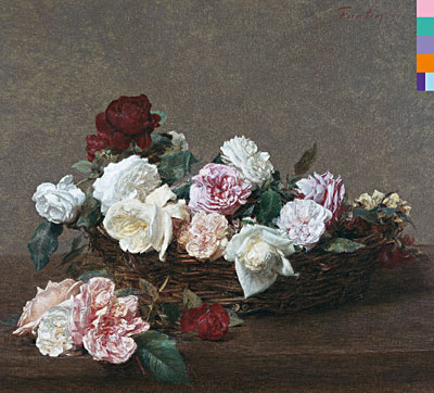
The image above looks a bit clearer than the original?

Ben wrote: According to fnac.com, the artwork for the remastered edition of Brotherhood would be this:
What the f***k is that?
I think that artwork looks a lot like this:

That's a close-up from the Frankie Goes To Hollywood-sleeve Maximum Joy from the year 2000! 
Luke wrote:
Ben wrote: According to fnac.com, the artwork for the remastered edition of Brotherhood would be this:
What the f***k is that?
I think that artwork looks a lot like this:

It's from Frankie!
It looks like the "State of the Nation" sleeve in negative with the "Brotherhood" typo on top of it.
Looks fucking great, I think. I'm sure whoever said that it's necessary to make it stand out on the shelf is right. Some 12" covers look shit when scaled down to cd size - the original work is one of them. It's reminiscent of UP, which is a nice link. I wonder whether Bill was involved.
BILL!
Ben wrote: According to fnac.com, the artwork for the remastered edition of Brotherhood would be this:
What the f***k is that?
What the fuck is with the type? The original had the type on a flat sheet, here the sheet is all wrinkled, so should be the type, or no type at all. Honestly I don't believe this is going to be the cover, seems like someone's played with NO art. Following this logic, the Movement cover should be also re-mixed.
I quite like it actually,but as a new sleeve,the remaster should stay faithfull to the originals IMO 
Nick King wrote: Well, browsing through the other FNAC images, the only one which looks vaguely different is PC&L:
The image above looks a bit clearer than the original?
Seems like that to my eyes too. Remastered tracks.. remastered covers!
looks like one of the worst covers they've ever had...
and that's saying a lot...
especially the horrible 'single's, 'waiting for the sirens call album, single', 'get ready', etc etc..
i know this has to be a joke, and not a very good one either..
if you ever wanted a reason NOT TO BUY the remaster, here you go...
later -1
the thinking.... new covers ---> collectors must have to buy now 
Hopefully Saville would be consulted about any changes to his originals who knows. I dunno.
Even Technique has had some subtle changes done to it according to fnac.com
 -"new"

-wikipedia
Retroesque wrote: Even Technique has had some subtle changes done to it according to fnac.com
-wikipedia
They look exactly the same to me, the first one though has the sharpened contrast effect that usually gives you the illusion of a better quality.
musicoloog wrote:
Luke wrote:
Ben wrote: According to fnac.com, the artwork for the remastered edition of Brotherhood would be this:
What the f***k is that?
I think that artwork looks a lot like this:

It's from Frankie!
It looks like the "State of the Nation" sleeve in negative with the "Brotherhood" typo on top of it.
It's not. As I said above:
I saw the original sheet of metal that was photographed for the Brotherhood cover when at the Peter Saville show in the Design Musuem a few years ago - was a lot shinier, like this picture.
It's probably just the same piece of metal battered with a mallet!
Ew. I'm hoping that's not the final artwork for Brotherhood. I liked the minimalist look of the original a lot better. I'll just cross my fingers and hope that this image was just a picture taken of the CD wrapped in plastic with a glare reflecting off it causing it to look this way. The artwork itself doesn't appear to be warped underneath, just the layer on top.
Igor wrote: The cover of Lowlife in fnac.com
is slightly different from what I'm used to
 It's the FNAC version the one I'm used to, with the "Ordernew" logo on the right side!
Right?:D
It's the FNAC version the one I'm used to, with the "Ordernew" logo on the right side!
Right?:D
I know im in the minority but I dont care much for the original artwork to Brotherhood. Its a bit dull and boring and reflects alot of the music. Hopefully the shiny new cover will reflect a shinier remaster. I think Brotherhood could have been brilliant if someone like Eno had produced it.
I like the Brotherhood sleeve, looks like a sheet of lead. As long as the US releases don't have New Order stamped on all the covers....


