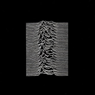
The new Arctic Monkeys album cover looks familiar?
Archived10 replies · 23,055 views

Bram wrote:
PSB could have done much better design for their cover than this blue zig-zag lines, very lazy and dissapointing in my opinion.
NotAMod wrote: More than a passing resemblence?

They can have a similar idea... it's been 34 years.
Looks lika bra or sunglasses to me. I don't get it.
NotAMod wrote: More than a passing resemblence?
They could stick Ian Curtis on the front and it'd still be a shit album.
0_o wrote:
NotAMod wrote: More than a passing resemblence?
They can have a similar idea... it's been 34 years.
Looks lika bra or sunglasses to me. I don't get it.
Agreed with the bra or sunglasses idea too...
I guess I should have put a "smiley" in my original post.
Just to clarify, it was meant as tongue-in-cheek and something spotted on a bored lunch break at work.
I'm not seriously suggesting "fan outrage" or owt and personally couldn't give a toss about the mild similarity.
However: white on black, variable frequency waves, it is a remarkably similar idea upon first glance.
Can't say I'm a fan of AM though, one band that completely passed me by.
NotAMod wrote: More than a passing resemblence?
The second image is now used for this classic 2004 trance monster:
