I know that the burning down of the building is to symbolize the end of Factory Records and the Hacienda and probably to some extent New Order's drug induced party days of the 80s, but what the hell is the deal with the couple on the beach?
J
34 replies · 1,186 views
I know that the burning down of the building is to symbolize the end of Factory Records and the Hacienda and probably to some extent New Order's drug induced party days of the 80s, but what the hell is the deal with the couple on the beach?
J
It's a scene from Fire Island (note that it's right next to the fire photo) with a campy hetero couple used ironically...the blow-up floaty ring symbolizes nothing if not a soft anus. Note the gay cowboys and queer raindrops as well on the Regret single.
I agree with Ron with the symbolism of the good and the bad in today's world(hence, the song "World on the album)and your interpretation of the Factory's downfall. However, I believe that the couple symbolizes blunt commercialism or materialism, which also could be the second meaning of "World." Note that the album cover of the singles and the CD say, "A New Order Release." Republic is OK, but it is the band's weakest album. The first half of the album are good, but the second hap was just a mish-mash of pop and a needless experimentation with rap. Republic is an anomaly in NO's repertoire.
Happy and tragic.
Much like NO's style of dancey yet brooding music, albeit the cover is a wee bit pretentious, in my opinion. The photo of a skyline is my favorite out of all the inner sleeve montages.
His Holiness, The Pope wrote: Note the gay cowboys.
you wish you knew how to quit Bernard???
Jeffari-al-Texani wrote:
His Holiness, The Pope wrote: Note the gay cowboys.
you wish you knew how to quit Bernard???

Isn't the symbolism of the guy and girl playfully fighting over a vagina-like ring a very obvious sexual metaphor???
Happy and playful but the flipside is the fire... cool colors and hot colors, life and happiness and (photo) staged optimism of the couple but also inevitable regret and loss, the duality and tension of existance
... I suppose I'm being too obvious
It's an excellent cover anyway
It's obviously bourgeouis couiple playing while the rest of the world burns around them - also reflected in the motif of the cowboys paradoxically becoming the signifier of the conjunctional "West" in direct antagonism to the symbiosis of the 'Other'. This subjugation breeds a long postmodern timeline of history - the rise and fall of economic hege,mony; illustrated by the car driving in to the flames of the oppressed minority.
That will be $10,000 please! Ka-ching!
HA HA , some people will actually spend four years in post-secondary and spend thousands of dollars to learn to talk like that.
It's really easy - just think 'Western Civilisation - bad', the 'rest of the world - good' and say it in the most complicated and obtuse way you possibly can.
There, you're a postmodern theorist.
Two things alone are responsibe for the Republic cover. The fact that Sav had just moved to America, and the fact that they'd just got a new photoshop chop filter.
So, Sav gets a load of stock images with a vaguely Californian theme and gets Brett Wickens to experiment with the software to see how they look when stitched together.
Good bad postmdodern sybolism my arse.
[magenta]shedmonite61[/magenta] wrote: Note that the album cover of the singles and the CD say, "A New Order Release."
All releases after the death of Factory are supposed to say "A New Order Release", it was one of the terms of the new contract with Warners/London Records.
The only thing the artwork for Republic says to me is "its time to sack Peter Saville". The fact that there hasn't been a good sleeve since only backs that thought up.
ally wrote: Where's this artwork you're all talking about
I'm just seeing orange :p
LOL
I so wish I had bought that, but I was a poor student at the time. i do however know where the copy I could have bought resides. It is with Mr Gillan Fanciers Society.
Saville said (at the time) the couple tugging at the inflatable ring along with the burning building were the symbols of Factory being pulled apart.
If you count the remaining images there are 11 - one for each song. He said he tried to find a stock image that evoked each track.
I have my own theory as to which image goes with which song:
Snowy mountain = Avalanche Cowboys = Regret (used for single sleeve) Destroyed house = Everyone Everywhere Mountain lake - World (used for single sleeve) Speeing car = Liar Fire = Young Offender Wave = Ruined In A Day (used on single sleeve) Misty forest = Times Change Bird Of Paradise flower = Special LA at night = Spooky (used for single sleeve) Soap bubbles = Chemical
In some cases it was a word in the lyrics, but I can't remember how I arrived at that specific combination. That was nearly 14 years ago!
Do you honestly think it was meant to symbolize anything other than to just 'look good'? All the previous sleeves never had that amount of deep,Freudian thinking behind them,they were chosen because of style,art & whatever Saville was into at the time & that the band 'liked' them.& if any of it symbolized the burning of the Hacienda,it must have been a different club that still existed for another 3/4 years then! Obviously,I could be wrong,but it just seems a little over-dramatic to me


Wasn't the cover something to do with the riots in California at the time? I seem to remember someone talking about people's houses being burnt while other people were having a laugh on the beach.
Steve Broad wrote: Wasn't the cover something to do with the riots in California at the time? I seem to remember someone talking about people's houses being burnt while other people were having a laugh on the beach.
That rings a bell.
The cover was desined to ape a cinema poster, hence the words "A New Order Release".
I agree this was the worst Saville cover ever.
Hank Wiseass© wrote:
Steve Broad wrote: Wasn't the cover something to do with the riots in California at the time? I seem to remember someone talking about people's houses being burnt while other people were having a laugh on the beach.
That rings a bell.
That, too, is correct, Hank. The photo was taken as the city burned. It was taken from Saville's window jus after he had moved there.
Blunderer wrote: The cover was desined to ape a cinema poster, hence the words "A New Order Release".
Wrong. "A New Order Release" was to do with transfer of rights on the products etc, and came about because of the change of labels.
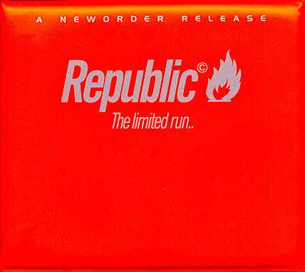
Along with GR, the least 'NO' of all NO covers... Still think it's ok, the glossiness and the use of 'real' images (as opposed to the more overt 'design' of previous efforts) suit the music perfectly... More throwaway and POP... Thanks to £50 Note for his thoughts on the relation of each pic to the tracks as well - I forget what my own views were now, but I always liked trying to work that out... If nothing else, Republic is the most interesting NO album cover to look at (once you've decoded the colours on PC&L)... Unless you have the limited run, in which ase it probably deserves to be kept floating in RCOKET'S MINTY BATH... 
Snorri xxx
ANd a FOOTNOTE told me by MARK from the RECORD PEDDLAR in MANCHESTER.The LIMITED EDITION pictures are WAXED so that the SURF BOYS could take their NEW CD.....COVER and PICS into the SEA without getting them WET.Now that is a TRUE story but is it TRUE?Have any of you surfed with yours.MARK either had a GOOD IMAGINATION,GREAT DRUGS or believed the HYPE.But he was THE MAN to get the GOODIES! As a footnote you KNOW CHORLEY DON'T SURF so i cannot CLARIFY!
I think the Limited Run actually looks quite good prefer it to the actual front cover, although I havn't really taken the time to look at it til now (doesn't often get played..)
Saville article Some very interesting stuff on this:
 "Source material and product related to Republic by New Order. The Cosmos brochure was found after (!) the record had been released."
Taken from worldinmotion.net: "- Peter Saville used the album cover of republic to comment about the decadence of today’s society. The image is clearly representative of the fall of the republic of Rome, and Peter Saville believes that our civilization is unfortunately heading in the same direction. Near the end of the fall of Rome, the patricians arranged for circuses to entertain the plebian while the cities declines. The cover shows two people playing on the beach, in the present day, while a house burns down next to them."
Inner sleeve:" This picture shows the transformation of the earth. We begin with the wave and water and water was the earths predominant feature about 4 billion years ago. Next we have simple life forms in plants and trees which inhabit the new terrestrial earth. With the formation of cities, pollution becomes a problem, and man has to inhabit "biospheres" because the earth will become uninhabitable."
Not sure who wrote said that though...
More importantly I think we should hunt down the couple on the cover and find out who got to keep the rubber ring! 
Some people may hate it and call it lazy but I really like the Republic era artwork and it's probably my favourite set of NO related sleeves. Even some of the promotional CDs had unique artwork which was a nice touch. Was dead chuffed when I hunted down the LP and all the singles on 12", always best to have the vinyl for the larger image.
Personally I don't think there's any really deep meaning hidden in the artwork. The glossy, colourful photographs and the use of the (c) next to each song title could denote they were subtley taking the piss out of the commercialisation of their music having just signed to a major. That's about as far as I'll ponder. I like £50 note's theory of an image per song though, hadn't heard that before but it could make sense.
Top sleeve
I really like the artwork. Its bright colourful and dead clever how they merge image into image
Tim wrote:
Blunderer wrote: The cover was desined to ape a cinema poster, hence the words "A New Order Release".
Wrong. "A New Order Release" was to do with transfer of rights on the products etc, and came about because of the change of labels.
Does that necessarily preclude the possibility that there was a thought process involved in coming up with that tag line, along the lines Blunderer states?