Skip to content

Influences On The Band

Archived

39 replies · 32,706 views

This is an archived legacy thread. Replies are closed, but the discussion is preserved.
· edited

Whilst posting on the 'Mick Middles book' thread, I started thinking about some of the of things that influenced the aesthetic of the band. Mainly the sleeve design, but other things too.

I thought it might be interesting to list some sources of things that the band/Saville 'borrowed' etc.

There's a part of me that kind of wants to collect all of these things, but that way lies madness:

'The House Of Dolls' novel (where the band's name was taken from, as well as providing the lyrics to the spoken word part of 'No Love Lost')

'History Of The 20th Century' magazine #50 (Bernard traced the cover of this for the drummer boy image on the 'An Ideal For Living' sleeve)

The book/magazine with the photo of Tsvi C. Nussbaum in Warsaw, 1943 (used on inside of the 'An Ideal For Living' sleeve. Anyone know where the is from? Possibly the same magazine as above?)

'The Cambridge Encyclopaedia of Astronomy' (1977 edition) (CP1919 'plot stack' image used on cover of 'Unknown Pleasures')

The magazine or book that Saville was reading that had the Ralph Gibson 'Hand Through a Doorway' photo used on the inner sleeve of 'Unknown Pleasures' (any idea where this came from?)

'Zoom' magazine (British edition) #10 (Mar-Apr '80) (where the Bernard Pierre Wolff photos used on the 'Closer' and 'Love Will Tear Us Apart' sleeves were used, I think! - anyone know for sure?)

'The Atrocity Exhibition' by J G Ballard (that provided the song title of the opening track on 'Closer')

The magazine/newspaper Saville was reading on Italian Futurism that he used for the 'Procession'/'Movement' sleeves.

'Strings Go West' LP by Super Sonic Strings (which, possibly provided the cover to 'Regret', unless it was nicked from somewhere else)

The magazine/newspaper Rob was reading that featured 'The New Order Of Kampuchean Liberation' headline, which gave the band their new name (no idea what newspaper this was from)

Anything else?

3 3 likes
· edited

perspexorange wrote:

The magazine or book that Saville was reading that had the Ralph Gibson 'Hand Through a Doorway' photo used on the inner sleeve of 'Unknown Pleasures' (any idea where this came from?)

Well that photo on the inner sleeve is from those Somnambulist photographs that you posted a link to in the Mick Middles book thread earlier today! Or have i misunderstood your question here?

But yeah, good idea for a thread, perspex and some great pics you've posted.Hadn't ssen the cover for that Strings Go West LP before but it has to be the inspiration for the Regret sleeve or was it entirely coincidental?

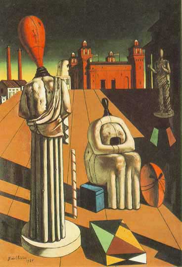
First one i can think of that springs to mind that you didn't include is the painting 'Evil Genius Of A King' (1914-15) by Giorgio De Chirico.Quite clearly influenced Saville's sleeve for Thieves Like Us and then Murder i guess.Saville has said in the past that the painting is where he took the idea from for the Thieves sleeve.There was even a tee shirt a year or two back with both the De Chirico painting and Saville's sleeve for Thieves Like Us.

1 1 like

perspexorange wrote:

'The Cambridge Encyclopaedia of Astronomy' (1977 edition) (CP1919 'plot stack' image used on cover of 'Unknown Pleasures')

Ahh yes, I took/posted a similar pic in Reply #13 of the Use Hearing Protection exhibition thread. I guess a lot of us who went to that in London or Manchester can at least say we've seen the book, even if we couldn't turn the pages on it. Same for the Closer book/magazine.

perspexorange wrote:

'The Atrocity Exhibition' by J G Ballard (that provided the song title of the opening track on 'Closer')

I wonder if Danny Brown fans are equally interested? I read Ballard's pervy Crash novel and also watched the 2015 film adaptation of High Rise (good cast!). Ballard is a bit weird isn't he? Might consider this though.

perspexorange wrote:

'Strings Go West' LP by Super Sonic Strings (which, possibly provided the cover to 'Regret', unless it was nicked from somewhere else)

Wasn't this a sort of Stock Image? Or maybe I'm getting mixed up with Chemical Brothers' Exit Planet Dust...

perspexorange wrote:

The magazine/newspaper Rob was reading that featured 'The New Order Of Kampuchean Liberation' headline, which gave the band their new name (no idea what newspaper this was from)

Supposedly The Sunday Times...

perspexorange wrote:

Anything else?

Well we did discuss films influencing song titles previously.

1 1 like

Fotz wrote:

perspexorange wrote:

The magazine or book that Saville was reading that had the Ralph Gibson 'Hand Through a Doorway' photo used on the inner sleeve of 'Unknown Pleasures' (any idea where this came from?)

Well that photo on the inner sleeve is from those Somnambulist photographs that you posted a link to in the Mick Middles book thread earlier today! Or have i misunderstood your question here?

Sorry, yeah, I probably should've been clearer. What I mean is, where did Saville (or Bernard etc) specifically find the image 'Hand Through a Doorway'? Was this (and the rest of the 'Somnabulist' pictures) in a magazine? And, if so, which magazine?

Fotz wrote:

But yeah, good idea for a thread, perspex and some great pics you've posted.Hadn't ssen the cover for that Strings Go West LP before but it has to be the inspiration for the Regret sleeve or was it entirely coincidental?

It's certainly possible that this was a stock image in a library of images, I guess. I first found out about it after a reader's letter in the NME highlighted the similarities.

Fotz wrote:

First one i can think of that springs to mind that you didn't include is the painting 'Evil Genius Of A King' (1914-15) by Giorgio De Chirico.Quite clearly influenced Saville's sleeve for Thieves Like Us and then Murder i guess.Saville has said in the past that the painting is where he took the idea from for the Thieves sleeve.There was even a tee shirt a year or two back with both the De Chirico painting and Saville's sleeve for Thieves Like Us.

Excellent! I forgot about that one! Didn't Saville also take the numbers from around the edges from some board game somewhere?

I also seem to think that a bootleg LP used that original image. I'll have a hunt around and see if I can find it.

Thinking of that 'Cambridge Encyclopaedia' book, I heard it was the 1977 edition, but I've read someone stated it was the 1970 edition. Anyone know? Also, I think the 'Transmission' 7" sleeve is taken from that same book. Do we know for sure? Would be good to see the original page.

1 1 like

Debaser wrote:

I read Ballard's pervy Crash novel and also watched the 2015 film adaptation of High Rise (good cast!).

I have the DVD of High Rise.Think i only watched it once.Nor sure the film worked really.The one thing i recall from it is (i think) Keeley Hawes' character in one scene saying "Right, who wants to fuck me up the arse?" !! [:eek]

2 2 likes

Debaser wrote:

perspexorange wrote:

'Strings Go West' LP by Super Sonic Strings (which, possibly provided the cover to 'Regret', unless it was nicked from somewhere else)

Wasn't this a sort of Stock Image? Or maybe I'm getting mixed up with Chemical Brothers' Exit Planet Dust...

Yeah - that's certainly a possibility, and one I was considering.

Debaser wrote:

perspexorange wrote:

The magazine/newspaper Rob was reading that featured 'The New Order Of Kampuchean Liberation' headline, which gave the band their new name (no idea what newspaper this was from)

Supposedly The Sunday Times...

I've certainly heard that mentioned, but I think I've heard talk of other papers or magazine supplements (The Guardian, maybe?) Would love to find this.

Debaser wrote:

perspexorange wrote:

Anything else?

Well we did discuss films influencing song titles previously.

Good call. I might dig up that thread.

2 2 likes

perspexorange wrote:

Fotz wrote:

perspexorange wrote:

The magazine or book that Saville was reading that had the Ralph Gibson 'Hand Through a Doorway' photo used on the inner sleeve of 'Unknown Pleasures' (any idea where this came from?)

Well that photo on the inner sleeve is from those Somnambulist photographs that you posted a link to in the Mick Middles book thread earlier today! Or have i misunderstood your question here?

Sorry, yeah, I probably should've been clearer. What I mean is, where did Saville (or Bernard etc) specifically find the image 'Hand Through a Doorway'? Was this (and the rest of the 'Somnabulist' pictures) in a magazine? And, if so, which magazine?

ah ok, i'm wiv yer now but no i don't know what magazine or book they'd seen it in.

perspexorange wrote:

Fotz wrote:

But yeah, good idea for a thread, perspex and some great pics you've posted.Hadn't ssen the cover for that Strings Go West LP before but it has to be the inspiration for the Regret sleeve or was it entirely coincidental?

It's certainly possible that this was a stock image in a library of images, I guess. I first found out about it after a reader's letter in the NME highlighted the similarities.

Actually, i have a vague memory of seeing that article in NME back then, yes.

perspexorange wrote:

Fotz wrote:

First one i can think of that springs to mind that you didn't include is the painting 'Evil Genius Of A King' (1914-15) by Giorgio De Chirico.Quite clearly influenced Saville's sleeve for Thieves Like Us and then Murder i guess.Saville has said in the past that the painting is where he took the idea from for the Thieves sleeve.There was even a tee shirt a year or two back with both the De Chirico painting and Saville's sleeve for Thieves Like Us.

Excellent! I forgot about that one! Didn't Saville also take the numbers from around the edges from some board game somewhere?

I also seem to think that a bootleg LP used that original image. I'll have a hunt around and see if I can find it.

I think the numbers idea came from Saville seeing them on a table at Blair Castle in Scotland.The bootleg LP you're thinking of is of the Bradford Caesars Palace , March 1984 gig.I have a folder with the recording and i thought i also had the image in the folder of the bootleg's s sleeve .But looked just now and the image isn't in there! Where has it gone? That's frustrating and i can't find the image online when i Googled it.I think it was actually a different De Chirico painting that was used however, not the Evil Genius Of A King one.

1 1 like

I recall reading that the newspaper that had the 'The New Order Of Kampuchean Liberation' headline as The Guardian.

1 1 like
· edited

perspexorange wrote:

Excellent! I forgot about that one! Didn't Saville also take the numbers from around the edges from some board game somewhere?

I knew I hadn't imagined it. According to Wikipedia, Saville took inspiration from 'The New and Fashionable Game of the Jew' ([:eek] )

Looking at the Saville sleeve, the numbers are in exactly the same order as those in the game, so he must've grabbed it from there.

Perhaps he just misremembered where he had seen the numbers. Or, perhaps more likely, he didn't want to throw any more fuel on the "New Order are Nazis' fire, by admitting he got the numbers from an anti-semetic game.

1 1 like

Fotz wrote:

I think the numbers idea came from Saville seeing them on a table at Blair Castle in Scotland.

Yeah. That sounds familiar, now you say it. Thanks.

I have found the game that I had heard of (see above post). Maybe Saville saw the game on a table at Blair Castle. Or maybe the table and the game just shared similar design aesthetics.

Fotz wrote:

The bootleg LP you're thinking of is of the Bradford Caesars Palace , March 1984 gig.I have a folder with the recording and i thought i also had the image in the folder of the bootleg's s sleeve .But looked just now and the image isn't in there! Where has it gone? That's frustrating and i can't find the image online when i Googled it.I think it was actually a different De Chirico painting that was used however, not the Evil Genius Of A King one.

Thanks. i knew I hadn't imagined it. I can't find the image either. Weird.

1 1 like

perspexorange wrote:

Fotz wrote:

I think the numbers idea came from Saville seeing them on a table at Blair Castle in Scotland.

Yeah. That sounds familiar, now you say it. Thanks.

I have found the game that I had heard of (see above post). Maybe Saville saw the game on a table at Blair Castle. Or maybe the table and the game just shared similar design aesthetics.

Hmm, this confirms that it was on painted table at Blair Castle, like you said, Fotz.

It also mentions Saville saw it pictured in a 'Country Life' magazine, so that's another source.

https://www.niagara.edu/neworder/singles/tlu.html

2 2 likes

perspexorange wrote:

perspexorange wrote:

Excellent! I forgot about that one! Didn't Saville also take the numbers from around the edges from some board game somewhere?

I knew I hadn't imagined it. According to Wikipedia, Saville took inspiration from 'The New and Fashionable Game of the Jew' ([:eek] )

Looking at the Saville sleeve, the numbers are in exactly the same order as those in the game, so he must've grabbed it from there.

Perhaps he just misremembered where he had seen the numbers. Or, perhaps more likely, he didn't want to throw any more fuel on the "New Order are Nazis' fire, by admitting he got the numbers from an anti-semetic game.

Wow, i've never heard of that or seen those images.It's quite clearly an inspiration for the TLU sleeve!! So yeah, which is it? The table at Blair Castle or that game? He saw the board game on a table at Blair Castle? But it's mentioned elsewhere that the numbers were on the table itself? All a bit of a puzzle!

This i think is the De Chirico painting used on the cover for the bootleg of the Bradford March 1984 gig.It was surrounded by numbers on the cover similar to they way the TLU sleeve is but the numbers on the bootleg sleeve were i think the date of the gig.I'm sure it was this one rather than Evil Genius Of A King.Can't be sure though as the bootleg cover image has mysteriously disappeared from the folder on my laptop. This painting by De Chirico is The Disquieting Muses (1916 or 1917 or 1918)

2 2 likes

Hmm. That does look very familiar. Wonder why we can’t find the bootleg online. Odd.

Looking at those two De Chirico images, I have to say, I love them. I should check out more of his work. (TLU has always been one of my favourite sleeves, alongside Murder).

1 1 like

Instrumental cover versions of old country songs.

Side A

A1 Billy Boy 2:12 A2 The Streets Of Laredo 2:13 A3 Bury me Not On The Lone Prairie 1:56 A4 I'Ve Got No Use For Women 1:55 A5 Jesse James 2:07 A6 Songs Of The Golden West 3:07

Side B

B1 Red River Valley 2:25 B2 The Old Chisholm Trail 2:03 B3 Whoopie Ti-Yi-Yo 2:12 B4 The Colorado Trail 2:19 B5 The Cowboy 1:52 B6 Home On The Range 2:32

Side A, track 2, The Streets Of Laredo is a song I remember being played on the stereo when I was a kid. Sung by Marty Robbins, perhaps some of our American forumites might know it too.

Big Iron by Marty is also worth checking out, if you like that sort of thing.

Now that I've gone massively off-topic, here's the theme from The Big Country (1958). Which you may recognise from 808 State & MC Tunes' The Only Rhyme That Bites (which kinda brings things back to Manchester)

2 2 likes
· edited

I guess the obvious one we're missing here is Henry Fantin-Latour's 'Basket Of Roses'.

Saville supposedly picked up a postcard of the painting at the National Gallery's gift shop, which gave him the inspiration.

2 2 likes

perspexorange wrote: Hmm. That does look very familiar. Wonder why we can’t find the bootleg online. Odd.

Looking at those two De Chirico images, I have to say, I love them. I should check out more of his work. (TLU has always been one of my favourite sleeves, alongside Murder).

Yeah De Chirico did some fabulous stuff.

Hurrah! I finally found the image on my laptop for the Bradford 1984 bootleg

1 1 like

perspexorange wrote: I guess the obvious one we're missing here is Henry Fantin-Latour's 'Basket Of Roses'.

Saville supposedly picked up a postcard of the painting at the National Gallery's gift shop, which gave him the inspiration.

I picked up the postcard too at a visit to the National Gallery once.I saw the original painting when it was on display at that Joy Division/ New Order exhibition in Manchester in 2017.Have a photo of it somewhere.Can't recall the name of the exhibition now, there's been so many of them.

1 1 like

Was Saville inspired by Josef Muller-Brockman's 1960 poster for Der Film? Was Der Film a show or something? Very similar to Saville's design for the Low Life sleeve with the font and overlapping words

3 3 likes

Debaser wrote: Instrumental cover versions of old country songs.

Cheers for these. Didn't think to check YouTube.

I guess the record sounds like you'd expect.

As regards that 808 State/MC Tunes track, I actually recognised 'The Big Country' theme when they sampled it. I have a knack of once hearing a tune, and never forgetting it. So I knew it was aWestern theme tune, but couldn't place it a the time.

Nice to hear it in full again.

1 1 like

Fotz wrote:

perspexorange wrote: Hmm. That does look very familiar. Wonder why we can’t find the bootleg online. Odd.

Looking at those two De Chirico images, I have to say, I love them. I should check out more of his work. (TLU has always been one of my favourite sleeves, alongside Murder).

Yeah De Chirico did some fabulous stuff.

Hurrah! I finally found the image on my laptop for the Bradford 1984 bootleg

Well done! Glad I didn't imagine it. Pretty cool cover. Some of those bootleg LPs were very well done.

Fotz wrote: Was Saville inspired by Josef Muller-Brockman's 1960 poster for Der Film? Was Der Film a show or something? Very similar to Saville's design for the Low Life sleeve with the font and overlapping words

Hmm, interesting. It is quite 'LowLife', isn't it?

Highlighting all of these influences makes it seem like we're trying to say Saville was a massive plagiarist. I'm not really. I think it's one thing to just swipe something and another thing entirely to take influences and apply them in interesting ways. I think, when Saville did borrow stuff, he did the latter.

2 2 likes

perspexorange wrote:

Fotz wrote:

perspexorange wrote: Hmm. That does look very familiar. Wonder why we can’t find the bootleg online. Odd.

Looking at those two De Chirico images, I have to say, I love them. I should check out more of his work. (TLU has always been one of my favourite sleeves, alongside Murder).

Yeah De Chirico did some fabulous stuff.

Hurrah! I finally found the image on my laptop for the Bradford 1984 bootleg

Well done! Glad I didn't imagine it. Pretty cool cover. Some of those bootleg LPs were very well done.

Yep it is pretty cool and well done, isn't it.Obviously the numbers down the left are the year and the top middle and then bottom middle are the month and day respectively. As for the numbers down the right , well i'm assuming it's just random numbers the creator put to fill the boxes .Unless there is some significance to them? 8,4,7,2 ??I've no idea.Cool cover either way.

perspexorange wrote:

Fotz wrote: Was Saville inspired by Josef Muller-Brockman's 1960 poster for Der Film? Was Der Film a show or something? Very similar to Saville's design for the Low Life sleeve with the font and overlapping words

Hmm, interesting. It is quite 'LowLife', isn't it?

Highlighting all of these influences makes it seem like we're trying to say Saville was a massive plagiarist. I'm not really. I think it's one thing to just swipe something and another thing entirely to take influences and apply them in interesting ways. I think, when Saville did borrow stuff, he did the latter.

Well i looked up the Der Film thing because i vaguely remember one or two articles over the years talking about the similarity of the Low Life cover's lettering echoing it.I'm sure Der Film was mentioned in somethings i read about Low Life's sleeve.I actually thought when i first clapped eyes on the Low Life sleeve the day i bought it on its release that there was something about it vaguely 1960s ish but couldn't put my finger on exactly what.Maybe it was indeed the font and i'd seen that font used in 1960s art and of course there was also the fact it is in black and white which is very 60s ish

But yeah, like you say, i'll also go with Saville taking his influences and applying them in interesting ways

1 1 like

Fotz wrote: Was Saville inspired by Josef Muller-Brockman's 1960 poster for Der Film? Was Der Film a show or something? Very similar to Saville's design for the Low Life sleeve with the font and overlapping words

Factory Records, the Complete Graphic Album, AKA FAC 461. That's probably where you read it. Go to page 88 (might be a different page on the re-released, re-packaged version):

...multi-layered composition is further enhanced by the over-printed text on the cover (which is a direct quotation of Josef Muller Brockmann's Der Film poster of 1960). The vertical orientation of the text was carried across to Fac 123 (see p91) where it is blind embossed.

Fac 123 is of course, TPK.

Just looking at the Discogs entry for TPK: "Released on 20 May 1985 as 12" and on 04 November 1985 as 7". Well that made sense (!). And "The single peaked at #46 in the UK charts." Well if you're gonna release the formats nearly 6 months apart...

4 4 likes

Debaser wrote:

Fotz wrote: Was Saville inspired by Josef Muller-Brockman's 1960 poster for Der Film? Was Der Film a show or something? Very similar to Saville's design for the Low Life sleeve with the font and overlapping words

Factory Records, the Complete Graphic Album, AKA FAC 461. That's probably where you read it. Go to page 88 (might be a different page on the re-released, re-packaged version):

...multi-layered composition is further enhanced by the over-printed text on the cover (which is a direct quotation of Josef Muller Brockmann's Der Film poster of 1960). The vertical orientation of the text was carried across to Fac 123 (see p91) where it is blind embossed.

Fac 123 is of course, TPK.

Just looking at the Discogs entry for TPK: "Released on 20 May 1985 as 12" and on 04 November 1985 as 7". Well that made sense (!). And "The single peaked at #46 in the UK charts." Well if you're gonna release the formats nearly 6 months apart...

Oh great spot, Debaser! Good work.Yes i have that book , the hardback edition and just checked out page 88 and yep, there it is the bit about the Der Film poster.Knew id read it somewhere.

Pedant's corner now but I'm going to have to dispute that Discogs claim that 20 May 1985 as the release date for the TPK 12". I bought the album and the TPK 12" on the same day, Low Life's release day which was 13th May 1985.I definitely bought the two on that same day.Maybe if they'd released the 12" a week or two before the album it'd have sold better? And i bought one of the Factory Benelux TPK 7" (there were 4 cover variations i think) in September 1985. There never was a UK 7" of TPK was there? Am i right? The Benelux 7" was the nearest it came , right?

1 1 like

Fotz wrote:

Pedant's corner now but I'm going to have to dispute that Discogs claim that 20 May 1985 as the release date for the TPK 12". I bought the album and the TPK 12" on the same day, Low Life's release day which was 13th May 1985.I definitely bought the two on that same day.Maybe if they'd released the 12" a week or two before the album it'd have sold better? And i bought one of the Factory Benelux TPK 7" (there were 4 cover variations i think) in September 1985. There never was a UK 7" of TPK was there? Am i right? The Benelux 7" was the nearest it came , right?

Release date: click (first charted May '85. Looks like fans bought it on the first week of release, then it fell down the chart)

UK 7" version: click

2 2 likes
· edited

Debaser wrote:

Fotz wrote:

Pedant's corner now but I'm going to have to dispute that Discogs claim that 20 May 1985 as the release date for the TPK 12". I bought the album and the TPK 12" on the same day, Low Life's release day which was 13th May 1985.I definitely bought the two on that same day.Maybe if they'd released the 12" a week or two before the album it'd have sold better? And i bought one of the Factory Benelux TPK 7" (there were 4 cover variations i think) in September 1985. There never was a UK 7" of TPK was there? Am i right? The Benelux 7" was the nearest it came , right?

Release date: click (first charted May '85. Looks like fans bought it on the first week of release, then it fell down the chart)

UK 7" version: click

The chart date of it being a new entry at no 46 19th May to 25th May 1985 tallies with the 13th May release date, like i said.In those days the UK Chart rundown was on Radio 1 on a Tuesday (it moved to Sunday teatime in October 1987 and then to Friday teatime in 2015).So the 12" was released on 13th May and then on Tuesday 21st the following week it was revealed as a new entry at no 46.If it had been released on 20th May it wouldn't have hit the chart rundown on Radio 1 until the following week on 28th May. Though it wouldn't have got a play on the Radio 1 chart rundown anyway of course because they only played or covered the top 40.

As for the UK 7" release.Well blow me down. I've had that Ivan Ivan edit as an mp3 on my laptop for years but never knew it was that edit that was used on an official UK 7" release in November 1985.I don't what i thought the Ivan Ivan edit was released on or when, i can't account for my gap in knowledge on that one.I never knew there was an official UK 7" ! How have i not known that all these years? Every day's a school day eh?

And not only was it silly to release the 7" 6 months later , it was bonkers to wait til then to release it because around the end of October/beginning of November 1985 (so around the same time as that UK 7" of TPK ) Sub Culture was released as a 7" and 12" in the UK.The releases would have got in each other's way, no? Or at least the Sub Culture release would have distracted from the TPK 7" release.That's maybe why i missed the TPK 7", i was occupied by the Sub Culture release.

1 1 like
· edited

Saville talks about the Der Film poster in Designed By Peter Saville, published in 2003. He says his New Order sleeves up to that point had been an exploration of 20th century art, and by using black and white photos of the band and a font similar to Helvetica he'd then caught up to the band present day.

The Perfect Kiss 12" is all about 4 color printing, which I see as an ironic joke since the album and singles are black and white: the cover is silver/grey, or 50% black and 50% white, and the four variant inner sleeves are cyan, magenta, yellow, and black.

The 7" was released in two variations: standard 7" edit (as on Singles) release concurrent with the 12", then later with the shorter Ivan Ivan edits. These are bundled in Recycle.

3 3 likes

IIRC, Saville stated that all the images on the Republic LP were stock photos - that was the thing he was into at the time. These images were then re-used / supplemented / combined for the singles.

2 2 likes

50poundnote wrote:

The 7" was released in two variations: standard 7" edit (as on Singles) release concurrent with the 12", then later with the shorter Ivan Ivan edits. These are bundled in Recycle.

Ah, that'll be where i obtained the Ivan Ivan edits from.Thanks 50poundnote.I am at an utter loss to how i didn't know those edits had formed an official UK 7" release in November 1985.

2 2 likes
· edited

50poundnote wrote:

The 7" was released in two variations: standard 7" edit (as on Singles) release concurrent with the 12",

I'm struggling to see this release* on Disocgs for UK Factory. Is it there?

* excluding white labels/promo/test pressing

1 1 like

Debaser wrote: I'm struggling to see this release* on Disocgs for UK Factory. Is it there?

Discogs isn't without error - it's crowdsourced, just like Wikipedia. It relies on peoples' general knowledge. Can you recall what day you bought a record 37 years ago? :)

Plus, as haphazard as Factory was, they probably wouldn't have precise release dates for their own titles, even if that documentation still exists in 2022. TPK was released on 7" in other territories at or around the same time as the 12"; I don't see why the UK would be any different. I know for a fact I had a UK copy of the first 7" before Subculture came out.

2 2 likes
· edited

50poundnote wrote:

Debaser wrote: I'm struggling to see this release* on Disocgs for UK Factory. Is it there?

Discogs isn't without error - it's crowdsourced, just like Wikipedia. It relies on peoples' general knowledge.

Am aware of that, but I cannot see a single listing for a 7" UK release of TPK other than promo versions or the later Ivan Ivan edit. Seems odd.

*EDIT* BTW does anyone know why the Ivan Ivan edit was released nearly 6 months later?

1 1 like
· edited

I'm just saying the introductory paragraph on the master page likely contains errors. Someone may have overlooked adding the standard 7". More likely, it was there, then someone else went in and modified it to be the Ivan Ivan variation, changing the release date. Someone may also be wrong about the Ivan Ivan versions coming out that much later.

official charts.com says it reached a peak position of 46 in the UK on May 25, 1985.

1 1 like

Debaser wrote:

Factory Records, the Complete Graphic Album, AKA FAC 461. That's probably where you read it. Go to page 88 (might be a different page on the re-released, re-packaged version):

...multi-layered composition is further enhanced by the over-printed text on the cover (which is a direct quotation of Josef Muller Brockmann's Der Film poster of 1960). The vertical orientation of the text was carried across to Fac 123 (see p91) where it is blind embossed.

Fac 123 is of course, TPK.

Thanks for this D! Great spot!

1 1 like

So was there a sleeve for that November 1985 official UK release of the TPK 7" that you've all only just got round to telling me about ? Was it a miniature of the 12" sleeve or just a generic plain black or white?

1 1 like

From Recycle (posted in 2009 before the deluxe editions were released):

The Perfect Kiss Factory Records FAC 123 Produced New Order May 1985

Tracklisting:

  1. The Perfect Kiss
  2. The Kiss Of Death
  3. Perfect Pit
  4. The Perfect Kiss (7" Edit)
  5. The Kiss Of Death (7" Edit)
  6. The Perfect Kiss (Ivan Ivan Edit)
  7. The Kiss Of Death (Ivan Ivan Edit)
  8. The Perfect Kiss (Live Video Version)

1, 2, and 3 sourced from Rough Trade DE 45 RPM 12" single FAC 123/RTD 022T 4 edited from album version, sourced from London Low-Life CD 8573 81313-2 5, 6, and 7 edited from elements of 1, 2, and 3 8 sourced from A Collection DVD

Notes from Bruce:

12" EQ matched to Substance. 4 with considerable bass added to make it fit in better 8 massive high cut and low boost, channels re-synced, phase on highs corrected, extra treble on right channel

This was much more work than I expected. It seems many UK copies have the A-side pressed off-centre, which causes a slight but noticeable wow/pitch fluctuation. I didn't want to gouge out the spindle hole on 50 Pound Note's copy to correct this, so I used my German copy (which I bought new sometime in the early 90s) instead.

The single edits were another matter entirely. As far as we can tell, the first UK single version was simply the album mix coupled with the 5-minute edit of Kiss Of Death on the flip. Since I expect any serious New Order fan already has a copy of Low-Life, I saw no reason in including that here. Anyway, apparently this was withdrawn and replaced with the much shorter Ivan Ivan edits. Outside of the UK, it seems the version released is what I'm presenting here as the" 7" edit. This is the album version with some very minor edits, and the five-minute Kiss Of Death (titled Perfect Kiss Instrumental on some copies) on the flip. I've heard of another withdrawn UK 7" version that supposedly contains unique elements not found anywhere else... but as I've yet to actually hear this, I'm not sure it exists.

The video of the song simply shows the band playing the song in their studio (filmed by Jonathan Demme). What's interesting is that unlike most videos, they're not lip-syncing to the album; they're actually playing the song live, so we've decided to include that here. The video version posed all sorts of problems for me: one channel slightly delayed, phase problems, really messed-up EQ (with less treble on the right channel)... I've been able to fix most of this, but there's still a bit of a comb-filter effect that I can't fix, and the phase between the two channels shifts around a bit at first. And then there's the fact that it sounds like it's out of tune compared to the album and single versions...

...at first, I assumed that the video version was likely playing at the wrong speed, since pitch often goes out the window when videos are converted from film 24 FPS to 25 FPS PAL TV broadcast, or from PAL to NTSC 29.97 FPS. And it's unlikely that the band would retune all their instruments for one song.

But upon closer examination, it turns out that the video is at concert pitch. The album and single versions play about 20 cents flat.

I considered the possibility that the album and single versions had been unwittingly slowed down. This sort of thing is rare, but it does happen (for example, every single copy of Miles Davis' landmark jazz LP Kind Of Blue made until the mid-90s has one side playing half a semitone sharp). Then I discovered that the video and album/single versions, though not in tune, are in near-perfect sync. If you pitch up the album (or slow down the video) they're in tune but they don't stay in sync at all. Since the song has sequencers and drum machines driving the tempo, it would seem unlikely that there would be any tempo variations between versions unless the band wanted them. The best guess I can come up with is that after recording the song, they decided the tempo was slightly too fast, and back then, the only way to address that was to slow the tape down, or re-record the entire song. Thing is, the difference isn't really significant... but it sure does sound rather jarring to hear the album and then the video. Truly an epic New Order track, The Perfect Kiss has everything that made the band famous: dark lyrics, driving synth chords, automated rhythms, and a long duration that builds into an incredible climax. It's also got a touch of daftness with the non-sequitur of sampled frogs in the middle. :) It marked the first time that a New Order single appeared on one of their albums, although the version on Low-Life is much shorter and a slightly different mix. This version starts to fade out just as the track is reaching its emotional peak.

Surprisingly, the full-length version has never appeared on CD. The version on Substance has about 40 seconds edited out (my favorite part of the song), supposedly done due to timing limits on earlier CDs. This has never been corrected, and the track has never appeared in full anywhere else. So, enjoy it here in its full glory.

From Jeb:

This is my favorite song of all time. The full-length version was the first New Order song I ever heard, but it would take another 18 months before things clicked and I started to really get into them. I used to mow lawns after school, and New Order become a constant companion on my Walkman. This song really captured my imagination, and because I hadn't seen the video (and wouldn't until 1989) I'd developed a really elaborate short film in my head that included things like a film noir plot with German dialogue and English subtitles!

The majestic synth jam at the end of the song - particularly starting at the 7:04 mark - still gives me chills 24 years later. When I got to hear it live at Wembley in '06, I nearly cried.

4 4 likes

FWIW what we presented as the 7" Edit in Recycle is the same as the U.S. 7" Edit on Singles and simply the 7" Edit on Total.

1 1 like
· edited

Fotz wrote: So was there a sleeve for that November 1985 official UK release of the TPK 7" that you've all only just got round to telling me about ? Was it a miniature of the 12" sleeve or just a generic plain black or white?

Looked in the folder for 50poundnote's Recycle on my laptop and the image is there for the 7".So a generic black sleeve, then.That's answered my question.Thanks 50poundnote and thanks again for your mighty Recycle job.

Listened again to the Ivan Ivan edit of The Kiss Of Death in the TPK folder of Recycle.Bit mad that edit in't it? .A bit all over the place but bonkers brilliant.You can never go wrong with a bit of cowbell and some all over the shop editing[:)]

I feel this thread has gone way off topic though.

1 1 like
· edited

50poundnote wrote: FWIW what we presented as the 7" Edit in Recycle is the same as the U.S. 7" Edit on Singles and simply the 7" Edit on Total.

Actually, the versions of the 4:25 edit on both Total and Singles (Remastered) are both unique and aren't identical to the 7 inch that appears on the vinyl.

For clarity, I'm comparing them to my copy of the Factory Benelux 7FBN 123 seven inch (here at Discogs). If you listen carefully, you'll hear:

Total edit: • Slight (tape?) wobble in the edit when the main track kicks in at 0:02 - not present on the Low-life or vinyl 7" versions • More noticable edit at the start of the 3rd bar after the chorus at 1:04 • Slight tape wobble on the edit at 2:07 • Section after the second chorus with Barney's guitar that starts at 2:07 and ends with the crunchy sounding synth solo is twice as long on this version (crunchy synth comes in at 2:21 on this edit - it comes in at 2:14 on the vinyl 7" edit). On this Total edit it's 8 bars long - on the vinyl 7" it's only 4 bars • Frog croaks and dreamy chords come in immediately after the crunchy synth at 2:51 - on the vinyl 7" there's four bars of drums first from 2:44

Singles (Remastered) edit: • Same (tape?) wobble in the edit when the main track kicks in at 0:02 as can be heard in the Total version • Noticably different edit after the second chorus at 2:06 (no clipped "wwhhh" at the start of Barney singling "when you are alone", which can be heard on the Low-life and 7" versions)

I can only speculate that there were several attempts to edit a 7" version back then, and the wrong edits were selected from various master tapes when Total and Singles (Remastered) were compiled.

So the both vinyl 7" versions still remain unreleased digitally - the FBN edit and the UK Ivan Ivan edit.

3 3 likes
· edited

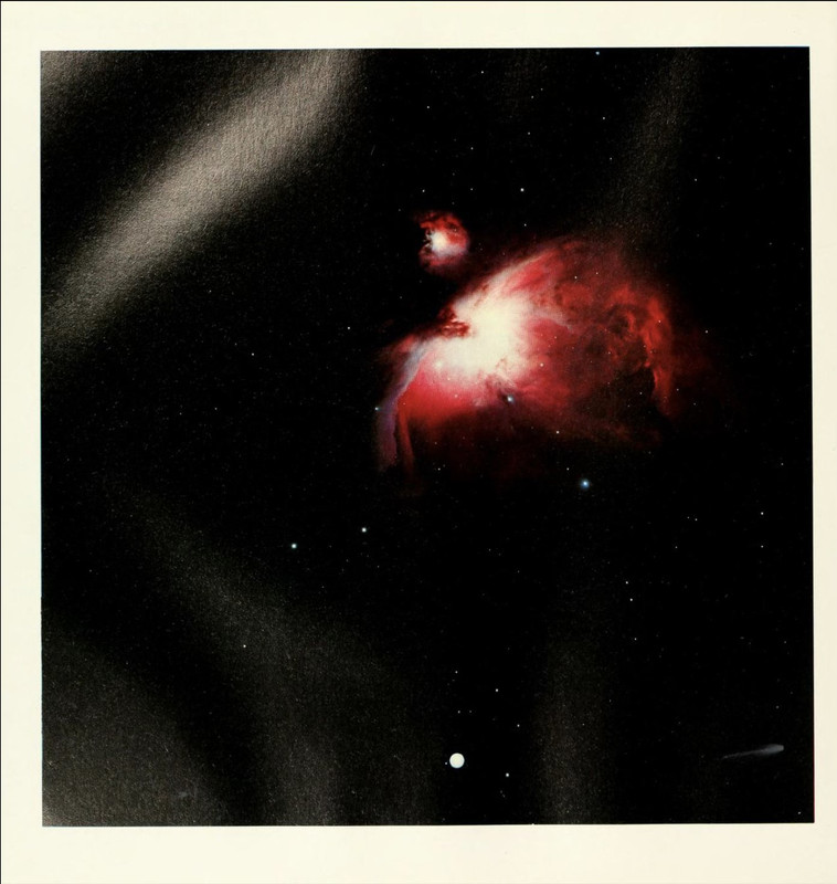
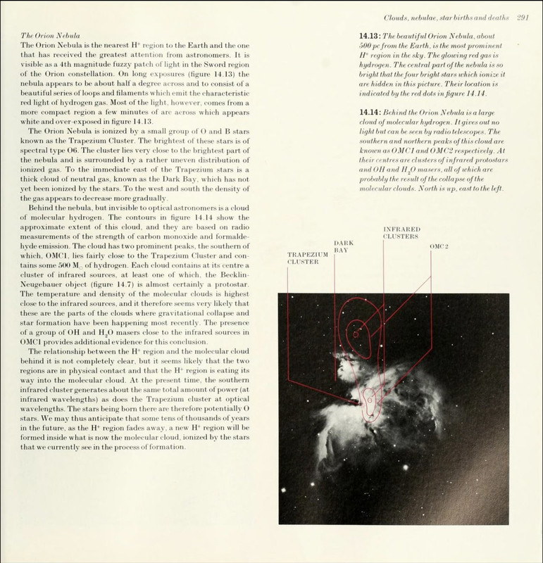
Managed to find a copy of 'The Cambridge Encyclopædia Of Astronomy (1977)'online, so have uploaded the images here:

pg. 111

pg. 290

pg. 291

Nice to finally see the Transmission 7" cover image how it originally appeared.

Anybody know where the back cover of the 7" and the two images on the 12" first appeared?

According to the 'An Ideal For Living' book:

"The back of the (7") sleeve is a photo found by Joy Division of a ball bearing being dropped through an electrical current. Saville, showing much the same perversity as the band, decided that putting the more spectacular picture on the back would be a novelty —and appropriate to the B-side. The 12", which was issued much later (probably due ot DJ requests), has the same feel as the 7" but features time-exposures of a fairground at night taken by photographer Charles Herring.'

4 4 likes

You're leaving NewOrderOnline

This link goes to an external website we don't operate, which has its own privacy policy and terms.

Destination:
Continue ↗